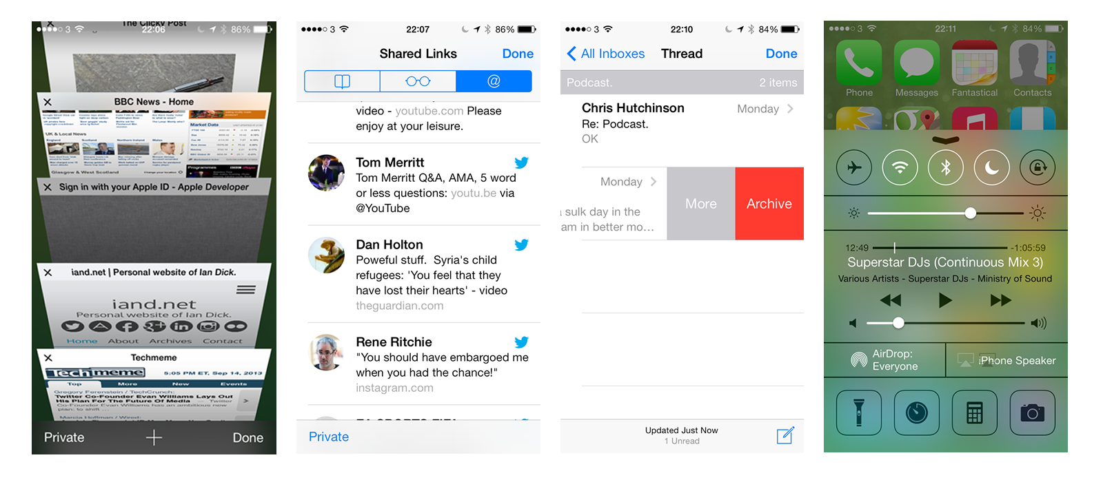
I picked up an Apple TV a few months ago and I’ve got far more use out of it than I expected. The following are some app’s and tricks that I’ve found handy in that time.
PlexConnect
The sole reason I picked up an Apple TV was PlexConnect. PlexConnect is a hack to allow an Apple TV to playback media from you local Plex library. It works by routing requests from the Apple Trailers app on the Apple TV to your Plex install and sending back results that the Apple TV expects that is really your Plex library. A clever hack but as with all hacks at risk of Apple making changes to disable it in the future.
An update a couple of months ago to add new channels changed the trailers app to only work with https. This was enough to break PlexConnect. Bad Apple. A few days passed before a fairly straightforward work around was published that looks worse than it is. Follow the steps and PlexConnect was back up and running.
At this point I found some issues with playback – stutters, frame drops. I was convinced that PlexConnect was no more and I would need to move to another solution – Roku or perhaps invest in a Mac Mini. It turns out my network switch was at fault so a swift replacement later saw PlexConnect returned to it’s former glory. I love it, all my movies available on the Apple TV without having to worry about converting to a compatible format.
Beamer
If Plex and PlexConnect seem like hard work but you want the flexibility of playing back any media on your Apple TV without converting to a compatible format then Beamer for Mac is a great option. Install and launch Beamer on your Mac and you are presented with a small window. Drop a movie of any format (AVI, MKV, MOV, MP4, WMV, FLV) on to the window and a few seconds later it will playback on your Apple TV all via Airplay.
Like any other movie on the Apple TV you can control playback via the Apple remote and Beamer supports 1080p and also 5.1 surround sound, both Dolby Digital and DTS. Subtitles are also supported.
On the movies I tested there was no issue at all. Smooth, quick and great sound. Considering this removes the need to convert films, jailbreak older Apple TV’s or mess around with PlexConnect the £12 cost is trivial.
iOS Setup
Setting up the Apple TV can be painful. Typing in the wi-fi password is an exercise in frustration with the remote. One shortcut is to use your iOS device. Switch on the Apple TV, connect it to your TV and touch the Apple TV with your iOS device. The Apple TV (once you zap in a password) will then copy wifi settings and automatically configure itself. Smart, and the touch isn’t really necessary as it’s not done via NFC but it’s just Apple’s way of ensuring that you get the iOS device in close enough range for bluetooth to work effectively.
Apple Remote for iOS
If you do have an iOS device, download the Apple Remote and use it to control the Apple TV. It makes for a far better experience and if you’ve used the physical Apple remote to search for music in a large library you will find the iOS version infinitely better.
Wrap-up
For £99 the Apple TV is good value and I’m getting a lot of use out of it. However I think I’d point people to the Roku 3 that has finally come out in the UK as it offers a lot more for the same money and a store where you can pick up app’s like Plex to further improve the Roku. Hopefully the tips above thought will make for a better Apple TV experience…and maybe one day Apple will bring an App store to it’s TV platform.
Samsung copies much of what Apple does, right down to the S4 being released in Gold, but in so many ways I’m glad they are polar opposite of everything that Apple does.
While it’s been outed for quite a while I’ve kept quiet on iOS 7 but with a release next week here are a few thoughts on what is the biggest change since iOS was first launched.
New Look
Much has been made of the flat design in iOS 7 which I happen to like. Gone are the textures that had become the butt of many a joke to be replaced by a flat colourful operating system. In general use it’s quick although there are a few animations that on first use are lovely touches but soon start to irritate as they get in the way when you just want to do something.
Over the course of the beta’s many of the jarring aspects have been toned down or improved like the ambiguous swipe to unlock that irritated so many pundits. While the design of buttons are flat there is a depth to the overall system in that panels like notifications appear on top of the current display blurring out the background. It’s an effect I really like. Wallpapers are also clearly behind icons and as you move the phone there is a slight animation highlighting the depth with icons and alerts moving slightly. Nice at first but feels a gimmick over time. Speaking of gimmicks, iOS 7 now supports dynamic wallpapers which react to the movement of your phone. Nice on the lock screen but thats about it.
A quick point on the new icons seen throughout iOS 7. Some I really like. Most are ok. A couple I think are so jarring, so much so I was convinced they were placeholders for WWDC and that they would be ‘fixed’ over the coming months. Alas, I was wrong.
iOS 7 icons
The examples above really jar with me in day to day use. They feel amateurish especially Newsstand. I mean, what where they thinking? Game Center – what do the blobs mean? At the end of the day they are only icons but you can’t change them and you see them all the time, constantly niggling away that they look like crap. It’s funny, I never really gave any thought to the previous icons but thats whats a radical change does to you – makes everyone a design critic. Another change is with folders – the old restriction of 16 apps per folder have been removed but less are now displayed on each folder page which I don’t like.
Another tweak is the removal of buttons and also the reduction of touch area’s. It takes a while to get used to and I really think it’s going to hit the casual user. The mums and dads, the grandparents that we’ve all convinced to use iOS devices as they are easy to use. This update is going to take them a fair bit of time to get used to and is probably the biggest risk for Apple but it’s a risk they had to take as iOS was in need of a restart.
New Features
There’s a lot of new in iOS 7 compared to previous releases. Control Center allows you to quickly toggle wi-fi, bluetooth, do not disturb and also launch the camera, a flashlight and control your music. Nice implementation of something that Android users have enjoyed for a few years and great to have in iOS. Notification Center has also been tweaked to surface more relevant content and also make it easier to segregate the many notifications you receive. It will show you upcoming appointments more clearly and also tell you when to set off to meet your appointment on time.
Another updated feature is Multitasking. A new card view allows you to easily swap to applications and dismiss others but iOS 7 promises to analyse your usage and ensure that app’s you use at certain times of the day will already have their feeds updated. Intelligent updates sound great and I’m looking forward to some of my fav app’s being updated to support this. The camera app has been updated and so like every other photo app it now has filters. Who would have thought filters would have become the must have feature. The Photo app also has does a great job of helping to sort your images by grouping photo’s into Years, Collections and Moments. A visual way of browsing through photo’s and it’s one of my favourite new features. They’ve also finally added shared photo streams via iCloud. A no brainer and shouldn’t have needed a new version of iOS to introduce this.
Airdrop finally allows you to share data with those on the same wi-fi network easily. Was a feature of Mountain Lion (maybe even Lion) so good to see it finally coming to iOS. Worth mentioning is iCloud Keychain which is a secure way of sharing passwords, credit cards, logins between your Mac and iOS devices but it’s now marked as coming soon – probably waiting for Mavericks to be released. Facetime now supports audio only calls too – free audio calling!
Finally app’s can now update automatically. Hurrah, although you miss understanding new features if you switch this on.
Updated Applications
All the existing app’s have seen their design changed to support the new look iOS. Some are quite subtle where as others feel very different. Almost all of the app’s have lost the skeuomorphic textures and design that had been favoured by Steve Jobs and Scott Forstall. Calendar, Maps and Weather fit in very well and even the refresh on Safari and Mail has seen some new gestures added to help with the usability of the app’s although Safari has a habit of hiding a lot of the UI which will cause confusion. Thankfully it’s finally got a unified search field. Thanks Chrome ;).
Updated applications in iOS 7
Reminders and Notes have been refreshed but unlike almost everything else have seen a paper texture applied. It looks weird in context with the changes. The Clock app has also seen one radical new feature – the icon is live and shows the current time with a swooping second hand. Mmm…great.
Verdict
So should you update? Well it’s a moot point as most will update over the next few weeks due to iTunes prompts or the pressure of app’s coming out that require iOS 7. On the iPhone 5 iOS 7 is a really nice upgrade. My 3rd gen iPad hasn’t faired so well. There were lots of rumours that iOS 7 on the iPad was ‘behind’. Apple have never demonstrated iOS 7 running on the iPad and there may well be a good reason with everyone pointing to new iPads in October. iOS 7 updated fine on my iPad but any text input, from unlocking the iPad to searching in Safari, adding text in Drafts or creating an e-mail would cause a 15-20 second pause where any typing was detected but the screen would be frozen. I eventually had to wipe and re-install which cured the issue but I’ve had a couple of reboot’s since. I’m convinced that iOS 7 on the iPad is a bit flaky so if you don’t need to I’d wait until the first patch release or the Apple event in October.
In general I like iOS 7 and despite the odd animation it feels fast on the iPhone 5. What I’m most looking forward to are the applications that will take advantage of the new features and also redesign to fit in better with the new look and feel. It will be an expensive few months as the reset will also be followed by many refreshed app’s that won’t be free. Time to get saving or find some iTunes card deals.
New iPhones
A quick word on the new iPhones. The iPhone 5c looks a solid phone but doesn’t interest me as it’s the same as an iPhone 5 with a colourful shell. What is nice is that iOS 7 knows the colour of the phone and selects a suitable background on first launch – makes the hardware look transparent.
The iPhone 5s, while sharing the design of the 5 features a few new features. Fingerprint unlocking is very nice as I unlock my phone so often with a passcode. The camera updates look great especially the slow motion video and the ability to take 10 photo’s per second. 64 bit should herald faster app’s over time and all this without a drop in battery life thanks to a small increase in battery size without any increase in the overall weight of the phone. I’m far more interested in a 64 bit iPad though.
Instead of black and white the 5s comes in white, gold or space grey which reminds me of the original iPhone. There are enough new features that I’m tempted to pick up a white 5s…but there’s still time to change my mind as there are no pre-order options this year. A solid update of a classic phone.
The original Google Nexus 7 is now 12 months old and has been replaced by a new version that has upgraded much of the tablet – retina screen, faster CPU, more RAM and a camera. Considering it will be only £20 more than last years model that’s quite an upgrade for an affordable tablet. I’ve had my Nexus 7 for just over 9 months and while it’s been a good device the overall experience makes it hard to really recommend an Android tablet.
Performance
One of the big selling points of Android 4.2 was Project Butter. Finally Google had addressed underlying performance issues so that there would be no stutter, scrolling everywhere would be smooth and Android could finally be viewed as an equal to iOS from a performance perspective. 9 months on and I have to say that there is still a considerable performance difference between Android and iOS.
On the Nexus 7 the performance issues have been exaggerated by an overall slowdown over time. This has been well documented and I was seeing it too. I’d launch Chrome and it would sometimes take 20 seconds just to launch and show the 2 or 3 tabs I had open. I tried many of the cleaner tools that are in the Google Play store and while they had an impact for a week or two the system would eventually fall back to it’s usual slow self. Thankfully Android 4.3 has enabled trim support and this has certainly had an impact over the last week but there is still a noticeable lack of smoothness throughout Android as a whole and I’ve got no faith that the stuttering won’t get worse again over time.
Can Google keep the new Nexus 7 from the same fate? At the moment, it’s very fast. Powered by a hefty 1.5GHz Snapdragon S4 Pro processor and 2GB of RAM, it flits around the OS with ease, and I rarely encountered stutters, jitters, or problems of any kind. (Except scrolling. Cool job Google.) – Google Nexus 7 2013 review
Even one of the most glowing reviews of the 2013 Nexus 7 acknowledges that it still has performance issues at a fundamental level. Well played Android.
When things go wrong
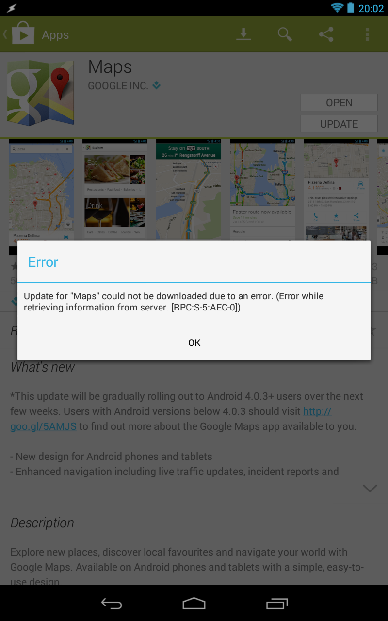
Android’s flexibility is fantastic, especially when compared to iOS. However when things go wrong it feels like you are dumped back a decade when trying to fix it. Just this week after applying Android 4.3 I hit a major issue – I couldn’t update any applications from the Google Play store. Worse, the error message was gibberish.
I tried switching off and on but it made no difference. To the internets, where it was clear that lots of people suffered the same problem and were stumbling through various fixes to try and solve the problem. I first tried the following fix:
Open system settings
Go to Applications (or Apps) >> All
From all apps select Google Play Store >> Clear Cache and Uninstall updates
Again, from All>>Download Manager >> Clear Cache and Data
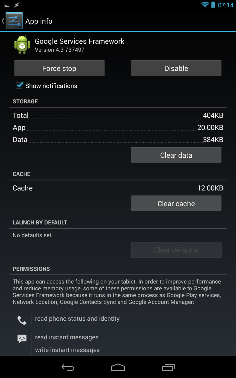
Finally, All >> Google Services Framework >> Clear Cache and Data
Now, rerun Google play store.
No dice. All applications would fail to update. So then it was onto the next fix all the while thinking that this felt like trying to fix an issue on Windows 95.
Things aren’t going well if you are having to use this screen
Go to system settings>> Accounts>>Google>>remove your Gmail account
Now from settings>>Apps>>All> Force stop, Clear data and cache for Google Play Store, Google Service Framework and Download Manager (like in method 1)
Now again go to settings>> Accounts>>Google>>Add your gmail account
Restart your android and then accept all the Google terms and setup Google settings
Rerun Google Play Store and update or install your app.
That almost fixed the problem except I couldn’t update Google Maps as it failed with the same error. Sigh. I tried again this morning and still had the same problem. So I wiped all accounts from the Nexus, wiped data on the Google Play Store and Google Services Framework applications, rebooted the Nexus and then added my primary Google account. Finally I could update Google Maps. What a farce. This isn’t the first time I’ve had issues that forced me to clear caches from applications to get them back running properly again and it’s one of the reasons I don’t recommend Android tablets to friends and family as the support time is far higher than with iOS.
Ecosystem
Application availability, especially for tablets, is still stronger on iOS than it is on Android. 99% of the time app’s will release first for iOS and generally be the better version. This hasn’t really improved over the last 10 months. I’m sure for phones it’s different but I can only compare what I use which is iOS and Android tablets. The exclusives are to be found on iOS and there is still a richer ecosystem on iOS when compared to Android.
Should I buy a Nexus?
That depends on who you are and what you want to do. Want to customise your device, root it, make it your own and happy to mess around when things go wrong – the Nexus 7 is great and the new hardware looks superb for the price. For everyone else I’d recommend iOS without any hesitation. Superior experience, great performance and devices that in general just work. I still fire up the Nexus from time to time but I’m really back on the iPad even for reading despite the size and weight. Speed wins.
24 hours from now the keynote will be done. Unlike other years there’s not been many leaks. Last year everyone expected Maps with Flyover, Passbook and Facebook Integration. This year we are expecting:
New laptops
Maybe a new Mac Pro
iTunes Radio – a Spotify competitor?
iOS7
OX X 10.9
It’s the software that’s most intriguing. We know we are in line for a new look in iOS7. How far will Apple go – they are usually pretty conservative with each iteration of their software. What I hope we see is lots of new features rather than a new skin or rehashed icons. That’s the difference this year – almost nothing has been mentioned when it comes to new features or changes to how iOS will work.
As for OS X, all I can remember is rumours of Siri on the desktop so for the first time in a while I’m looking forward to a keynote full of surprises. Can Apple deliver?
Hardly a new device and probably the wrong time to buy an Apple product just two days before WWDC, but I purchased an Apple TV and really only for one reason. Plex, or more specifically PlexConnect. The most notable feature of the latest Apple TV is that it cannot be jailbroken which has lead to the unusual situation that older models are worth 2-3 times more on eBay as they can be jailbroken and you can then install app’s like Plex on it.
So I was surprised last week when catching up on my feeds that PlexConnect had been developed and announced on the Plex blog. It was a hack, and undoubtedly a hack that Apple will stop with a future firmware update but it was enough for me to stump up the cash and give it a whirl. Setup is pretty easy. Set your Apple TV to a fixed IP address, set your Plex computer to a fixed IP address, change your Apple TV DNS to point to your Plex computer and then launch PlexConnect. Boom. (photo’s are pretty poor – hastily snapped from my iPhone as I couldn’t be bothered getting DSLR, tripod etc – blame my cold!)
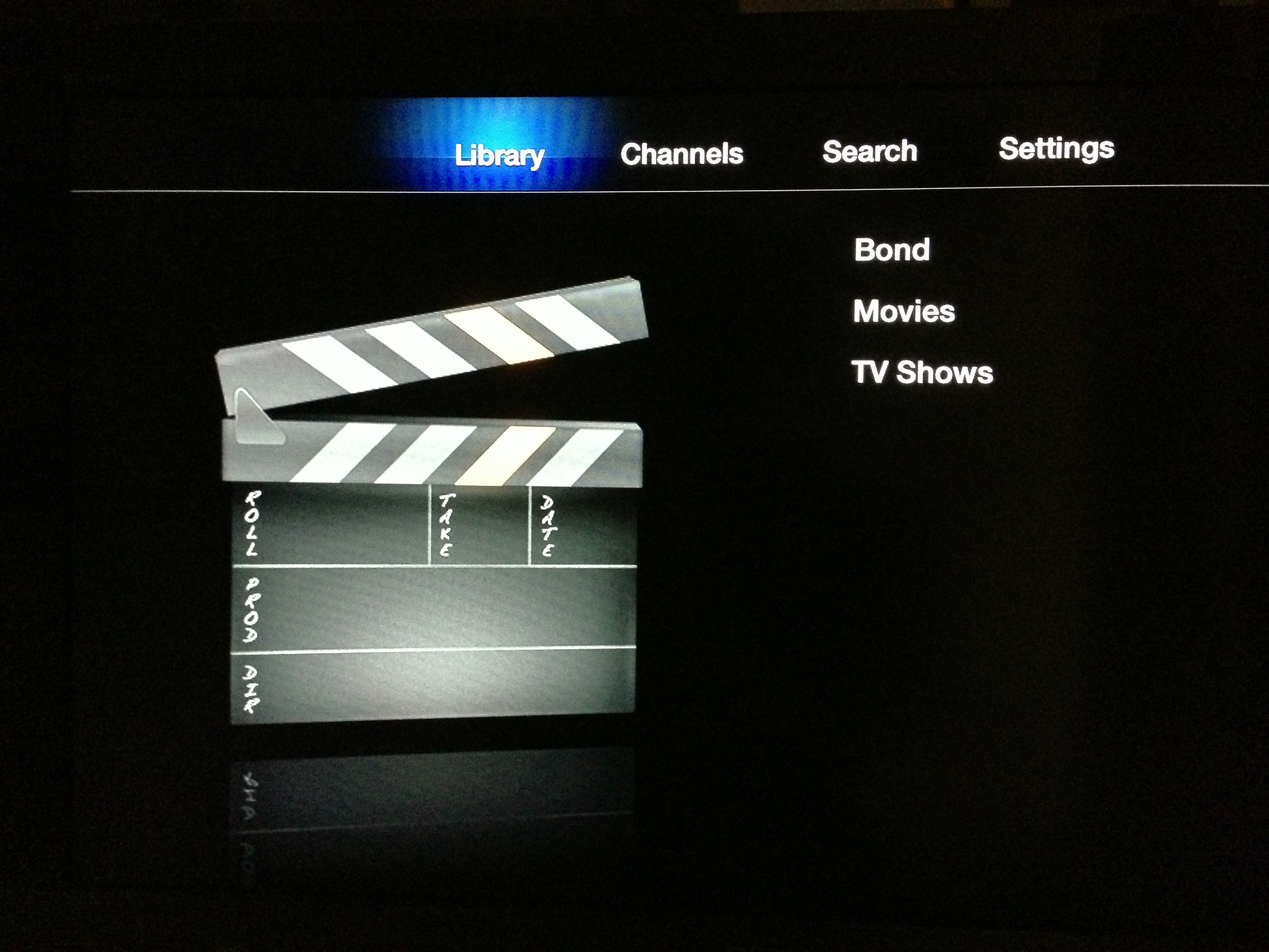
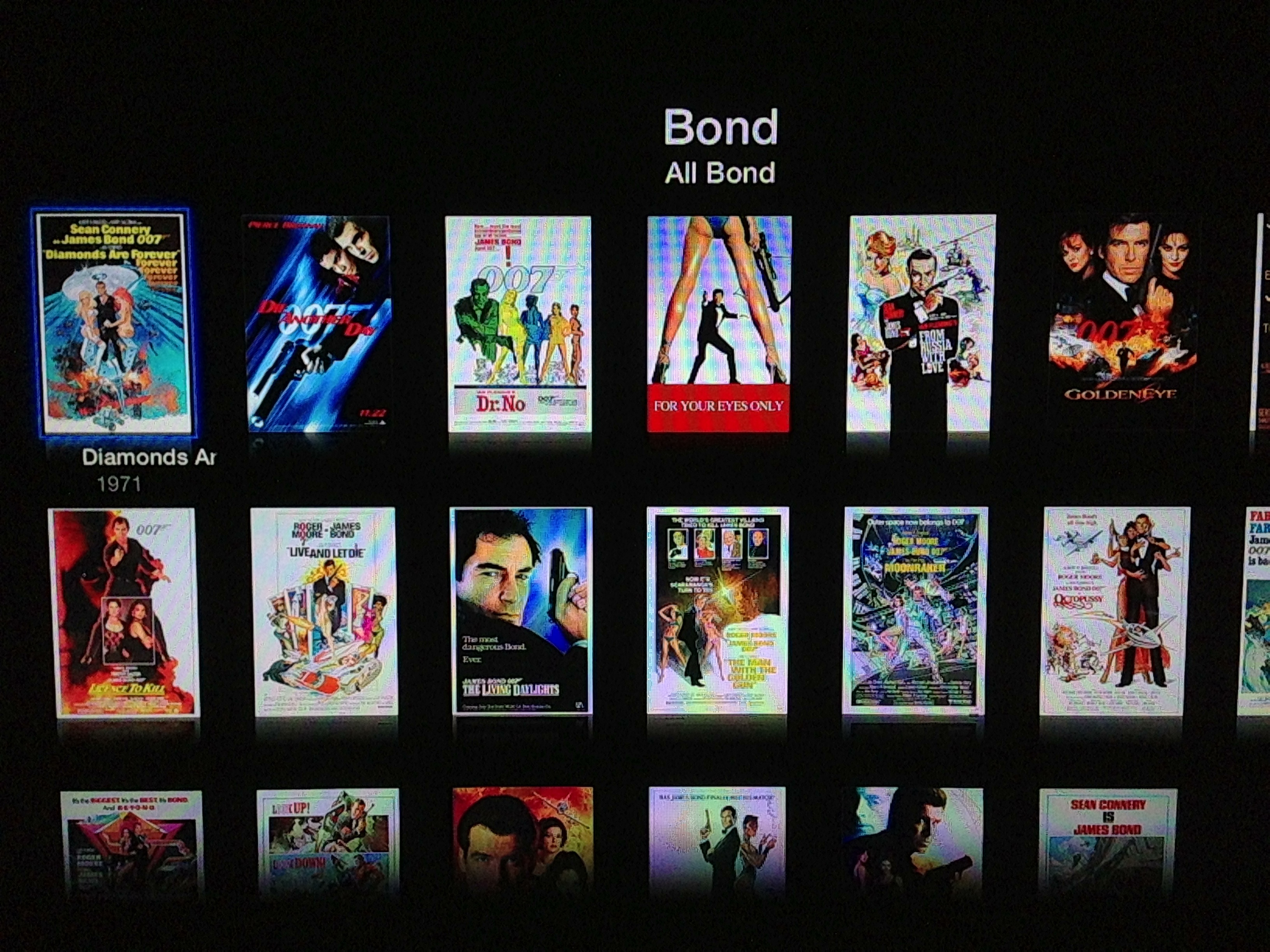
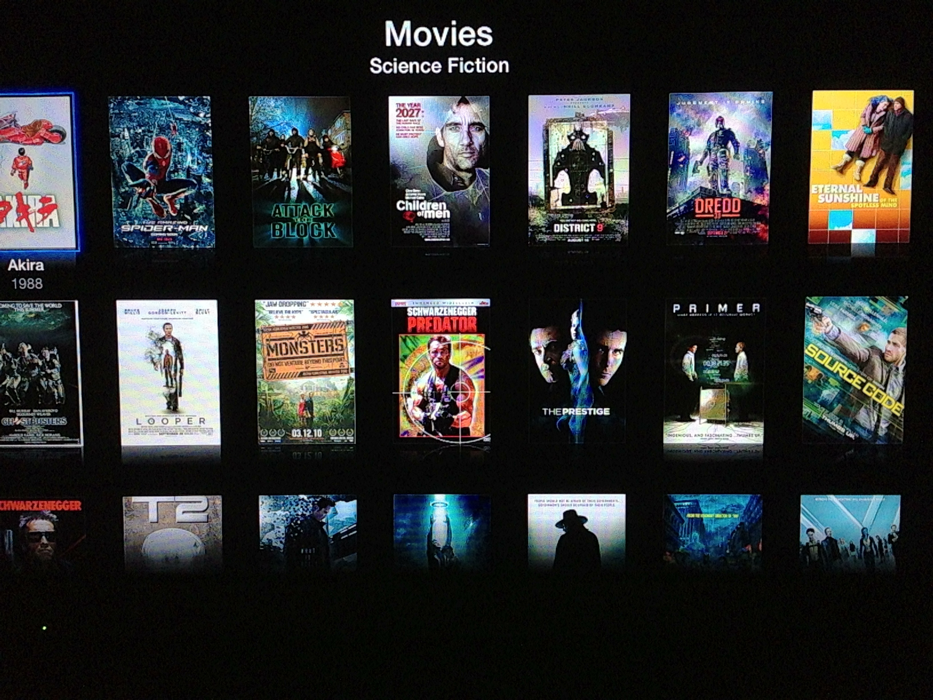
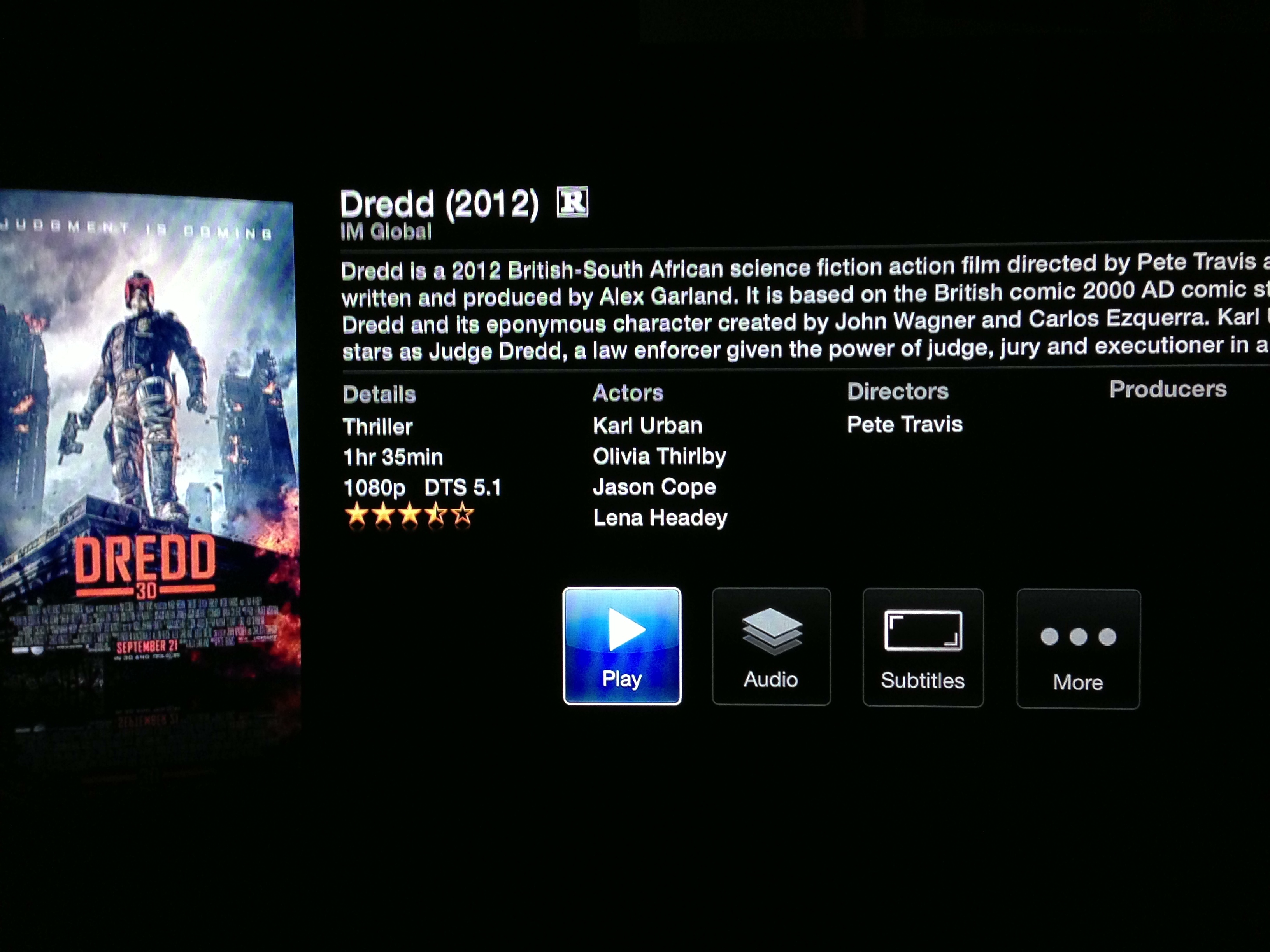
Grid view for moviesBrowse by genre
The reason it’s a hack is that you access Plex via the trailers app on your Apple TV. PlexConnect works as follows:
re-use an already available app (like YouTube, Vimeo, Apple Trailers, …)
re-route the request to your local Plex Media Server
re-work the reply to fit into AppleTV’s XML communication scheme
let iOS do the rest
So far I’ve been impressed. All movies and TV shows have worked without issue. It’s not got the full Plex experience but it’s so close that it’s not really noticeable and all from a £99 tiny box with a dead simple remote. I sold my Mac Mini late last year and the one thing I really missed was having Plex – the bluray player I picked up is great for blurays and for playing content accessed via USB, but streaming is awful.
Some quick thoughts on the Apple TV itself. It’s tiny and quiet and the remote feels nice in the hand, is simple and probably does just enough considering what the Apple TV offers. It’s very much tied to the Apple ecosystem and I guess that what frustrates so many people. It’s a platform waiting to be exploited and the hardware is fairly capable – it’s playing 1080p without much trouble. I do think it’s a next gen device though before we see an App Store. It’s weak link is the remote. It allows you to browse around apps easily enough but thats about it. It wouldn’t act as a good interface for games, browsers etc. You can use the remote application on iOS to control the Apple TV, but I don’t think thats a route Apple would go down – buy a device for £99 and spend upwards of £200 to get a touch controller.
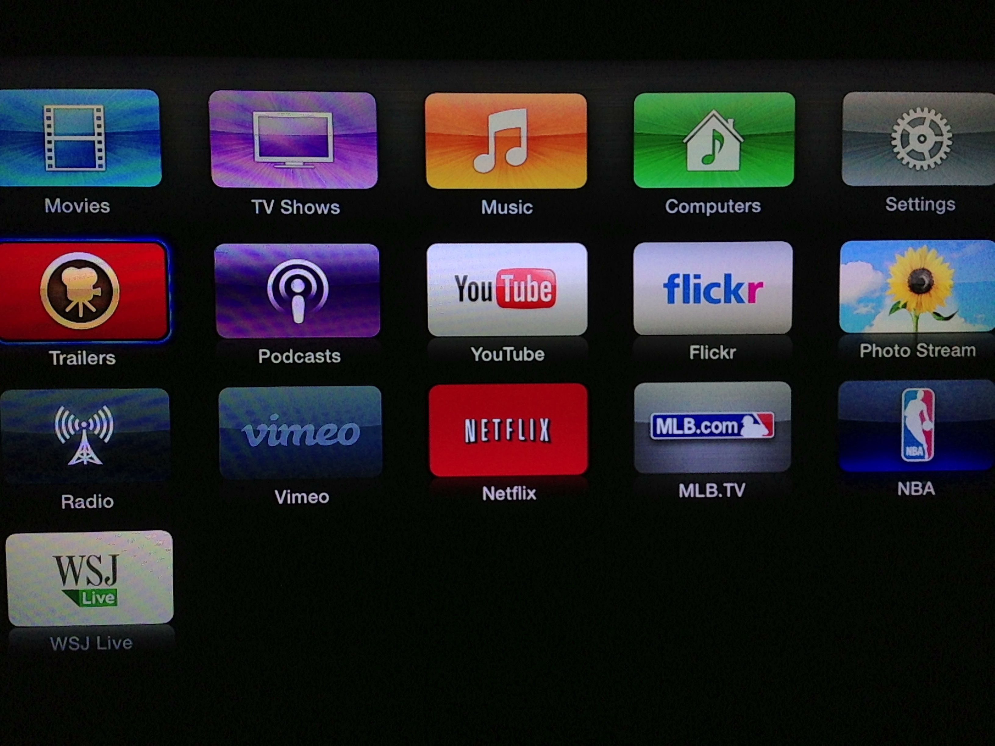
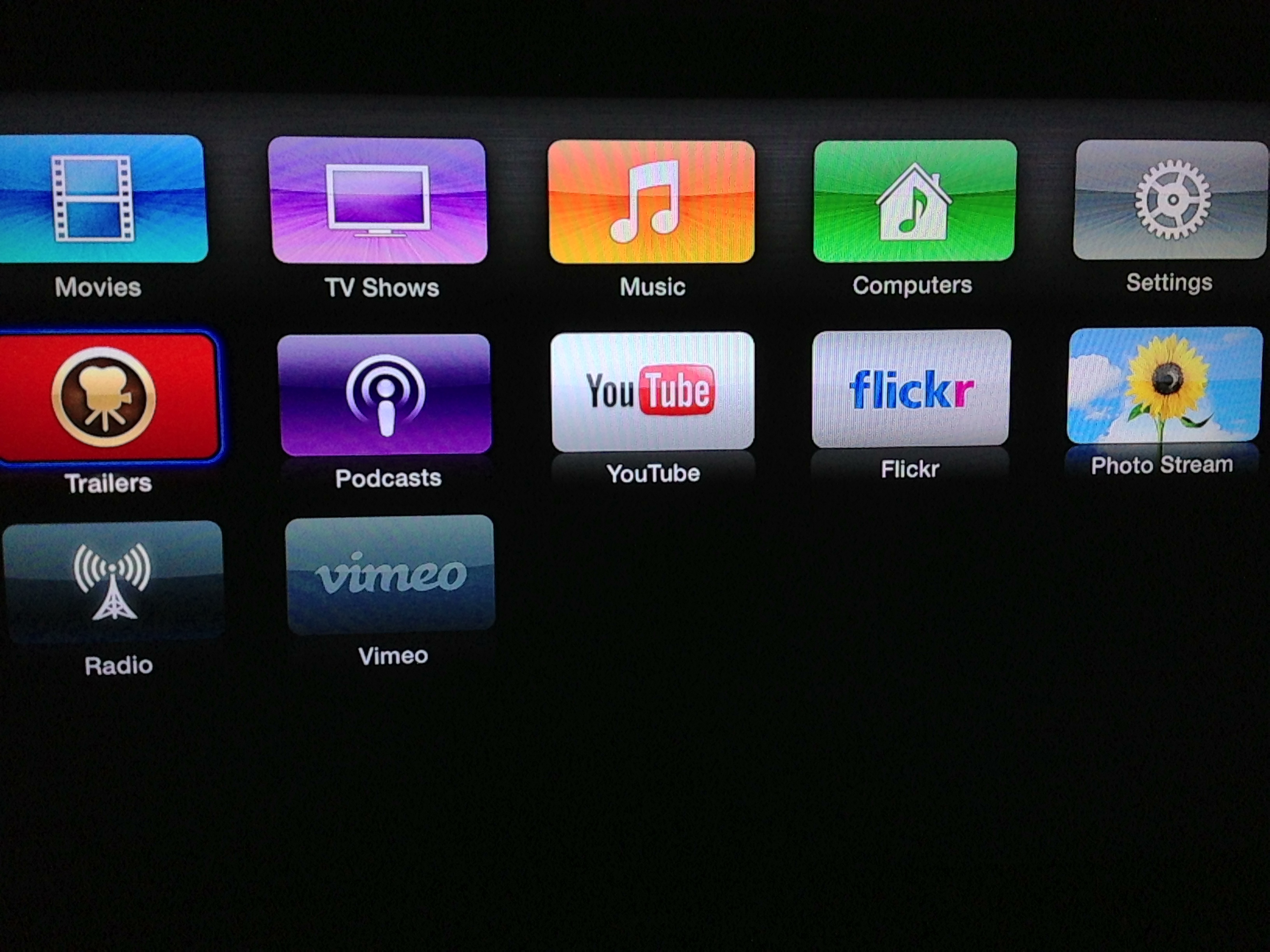
Icon order changed on the Apple TV
The front end feels old compared to Plex, XBMC etc and allows for very little customisation. You can move the app’s around and thats pretty much it. One way to remove apps is to enable Parental Controls and hide the applications. Makes for a slightly cleaner interface but with so little on the front end it makes only a minor difference.
Parental controls enabled – you can hide unused icons!
Music playback from a local library or iCloud is fine although again the interface feels simple and lacking some options and customisation. It is nice to be easily able to play podcasts on the TV again. Airplay also works really well – it’s great to throw a video onscreen rather than view on the iPad.
Overall I’m pleased with PlexConnect. It’s early days for it but it already works well for me. Your mileage will depend on where you host your Plex library. Some NAS devices aren’t supported or will struggle if they need to transcode the file to display on the Apple TV. If it wasn’t for Plex though I’d get a limited amount of usage out of the Apple TV. It still feels like a cut down product – Apple could and some day will do so much more with the television market, undoubtedly not with this generation of Apple TV. I really look forward to the day that there is an App Store on an Apple TV where we can buys apps like Plex and have access to a wide variety of apps and games. Until then, PlexConnect will do nicely.
Apple and Samsung take contrasting approaches to advertising for two similar products – the iPhone 5 and the Galaxy S4.
Apple’s advert is aspirational, focussing on the user and how they get most out of the device and it’s app’s. It appeals to different type’s, from runners to food bloggers, travellers to kids. For me it’s one of their best adverts in years.
Samsung focus on their product but can’t do so without some unfunny dialogue and dinging the competition. Comes across as cheap. Maybe they aren’t trying to target me but that style of advert is a total turn off.
While Samsung have consistently copied the competition when it comes to their products I’m glad that hasn’t extended to their advertising campaigns. Yet.
I picked up my iMac back in 2011. As usual with Apple products I ordered the smallest RAM possible and picked up some Crucial to take it to 16GB. At the same time a colleague was also buying an iMac so I passed on the Apple RAM at a low cost to him as it was no use to me. That was my first mistake.
Over the last year I was getting infrequent crashes, every 2-3 weeks, almost always when iTunes was running. I put it down to software and looking at the crash dumps I was always drawn to a graphics card driver issue. I dismissed it as that, hoping an OS X update at some point would resolve it. It didn’t. That was my second mistake.
At Christmas I dug deeper, downloading a memory module checker and checking the RAM chips individually. Turns out I had some faulty RAM and that was something that I had introduced to the system. I bought some replacements (RAM is ridiculously cheap now) and in the last three months I have had zero crashes. Happy days but a lesson learnt. I’d still recommend buying a Mac with the minimum amount of RAM assuming you can easily replace it, but keep the Apple original in case your replacement chips are faulty and if you ever have to return the Mac to Apple.
One aspect I’ve loved with the iMac is the screen. 27 inch and with a resolution of 2560×1440 it’s been a joy to use. Despite it’s size though, I’ve often wished for more. A second screen would really help day to day and especially with the podcast. After thinking and researching for a while I finally plumped for the Asus PB278Q.
Why do manufacturers persist with tacky stickers?I’m quite picky about the kit I use and while it would have been fine I’d have always been a bit ticked off with a physically smaller second screen or one with a lower resolution. The Asus is a 27 inch screen which is the same size as the iMac and also shares the same resolution – 2560×1440. Another obvious choice would have been the Apple Thunderbolt Display but that costs £899 and has no flexibility when it comes to adjusting screen height. The Asus is fully adjustable and can be rotated 90 degrees too. It also cost £467 from Amazon which is a massive difference to the Apple Thunderbolt. Other options were from Dell and Samsung. Although Dell have been making monitors for years looking at recent reviews and also customer comments on Amazon there seems to be an issue with quality control and although most were happy with the product, there were too many who had real issues with their monitors. As for Samsung, it didn’t look the best, the Asus had far better reviews…and it was a Samsung :-). First impressions out the box were good. Design wasn’t a patch on the iMac but it was sturdy with a good base. The only initial negative was the garish stickers that PC manufacturers love to put on cases, laptops and monitors. Thankfully they were easy to remove leaving just the button indicators, the ASUS logo and the unnecessary HDMI and DisplayPort logo’s on the front. When will they learn. The material is black matte plastic and although the bezel is a touch larger than I would have liked, it does melt into the background in use.
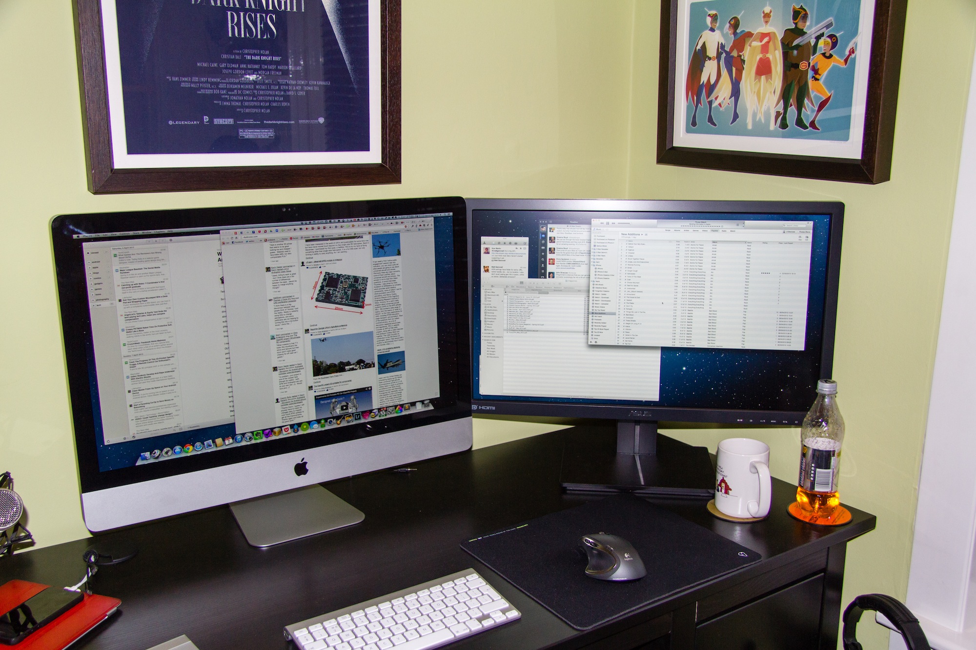
iMac and Asus – look small in the pic but they are both 27 inch screens
The Asus comes with lots of connectivity options – HDMI, DisplayPort, VGA and DVI and admirably comes with a full set of cables in the box. However for the iMac I needed an mini-DisplayPort to DisplayPort but there are some great sub £10 options on Amazon. Setup was easy. Plugin the cable, power up the monitor and the iMac auto detected the screen and enabled an extended desktop giving a total resolution of 5120×1440. Thats a lot of pixels and brings me to my biggest fear when it comes to screens. Dead pixels.
I shouldn’t really check as chances are in day to day use it would be unnoticeable…unless you go hunting, but hunting I went. Happily the Asus has no dead or stuck pixels. The screen itself is more matte than the iMac so reflections are much reduced. As for the screen itself I think it’s excellent. Clear and crisp, no noticeable lag with my ageing eyes and I can use it easily all day long without any tiredness. Applications were well sized, nothing too small or unclear and full screen video was crisp and clear – no smearing that I could see. I don’t really game too much on the Mac although have been bitten by the emulator bug over the last couple of weeks, but that’s for another post, but the games I tried all played well.
The menu controls are easy to use and give you full control over screen colour, brightness etc and also allow you to flick between a number of presets. It was straightforward to match the iMac display so it looked roughly the same to my eye’s. You can also control audio levels as the monitor has built in speakers which are ok, but nothing spectacular. You can alter menu positions, menu language and also turn off the power light indicator which makes the display on the front of HDMI and DisplayPort logo’s even more annoying. I might have to find some black tape. Apart from that I’ve nothing more to say technically about the monitor and I’ll point you to TFT Centrals review of the PB278Q which is incredibly detailed and covers all aspects of the monitor. Suffice to say, they liked it.
I’ve had the monitor for a week now and love it. It’s a luxury purchase but delivers a big gain in productivity. 2 years ago I was sure I didn’t need anything more than a 27 inch monitor, I’m now pretty sure that I don’t need a third monitor…but in 5 years time will it be two retina monitors? Time will tell.
After months of rumour and a week of waiting I finally have the iPhone 5. Technically the sixth iPhone (and my 4th after the 3G, 3GS and 4) I decided against queuing up and this time pre-ordered online and waited patiently for UPS to deliver mine on Friday. While it was great for me the UPS guy didn’t share my enthusiasm as they had thousands to deliver on Friday. Interestingly Apple still had phones to sell on Saturday in Glasgow despite the long queues. Seems to be a lot more stock than in previous years. After a few days use here are my thoughts on the iPhone 5.
Design The all black iPhone 5Despite all the screenshots and video reviews I was still surprised when I held the iPhone 5 for the first time. It is lighter than expected, much lighter. I’m not sure if thats due to it being slightly taller so the expectation is of a certain heaviness…but it even feels kind of empty when you hold it. It’s remarkable how thin and light these devices are getting.
The metal back should make the iPhone more durable and also helps to reduce weight. The iPhone 5 comes in white or black and I chose black as it’s far less distracting when looking at the screen. It’s also all black. Everywhere. No silver antenna around the edge – all black. The buttons are all black. The Apple logo and text on the back – black. I should really do a fifty shades of black joke right now. No?
Some have described the iPhone 5 as jewel like. This is mostly down to the chamfered edge which does prettify the phone and helps the feel in the hand but one downside is the many reports of nicks and scuffs that the black iPhone 5 is now prone too. I detest scrapes, scratches and marks on my gadgets so I will admit to being a bit nervous about damage over time. Looks like a case is a necessity as I do take care of the phone and I will be looking to sell on in a couple of years time. I’ve been burnt before with cases that also scrape (looking at you iPhone bumper!) so I’ve ordered a sleeve for the iPhone 5 until I can sort out a decent non marking case. Annoying as I hate covering up such a great design.
The move to a slightly taller phone and a 4 inch screen has made the iPhone 5 feel narrower. It is exactly the same width as the 4S and 4 but looks and feels narrower. The screen has moved from 3 1/2 inches to 4 inches but the phone has only grown by 8.6mm. Even writing that makes the change seem small but it’s a noticeable change from the 4. It still fits in the pocket and I’m pleased it’s not got wider. I can still use the phone one handed without having to constantly re-adjust how I hold it.
I’ve said all that without mentioning it’s thickness – just 7.6mm. Not the thinnest phone out there but not far off it. The thickness coupled with the slight increase in height and decrease in weight makes it feel a smaller phone. A smaller phone with a bigger display. Quite a feat.
Screen
186 pixels. Thats what the move from 3 1/3 to 4 inch has given the iPhone 5. It sounds a small change but it does benefit one area greatly – video. Finally iPhone users have 16×9 playback of video. It also offers developers a chance to re-imagine their apps to take advantage of the screen. Calendar now show’s a full week view, e-mail and messages show an extra row and most importantly you get an extra row of app’s in the home screen. Joke.
A whole extra row of apps
So the extra pixels will get most attention but the screen quality is much improved. Blacks are blacker. Colour is better. Certainly pops more than previous iPhones but not as vibrant as a couple of Android devices I’ve seen which appear over saturated to me. Going back to the blacks, when an app is running in letterbox mode as it’s not been updated to support the iPhone 5 I can’t tell where the screen stops and the facia starts. The blacks are that good. This is the main reason I’ve stayed away from white iPhones – the black facia disappears but the white one stands out.
Lightning
A controversial change is the new Lightning connector which replaces the 30 pin dock connector that Apple have used for 9 years. The current connector is everywhere – stereo’s, battery packs, cars, hotels. It’s so pervasive that any change was bound to stoke anger.
New and Old – Lightning vs 30 pin dock connector
What I didn’t expect, even after seeing the new slot in the iPhone, was just how small the new Lightning connector is. It’s tiny! It’s like a lego version of the old connector. It’s obvious when you compare both as to why Apple had to change. It’s a painful and expensive upgrade for consumers though. A Lightning to 30 pin adaptor from Apple costs £25. A Lightning to USB cable costs £15. You get one of those cables with the iPhone but I’ll need another two. I’ll also still need the 30 pin cable for the iPad. Transitions like this are painful but necessary. It also makes me think that docks are a thing of the past and that a move to Bluetooth or Airplay for connecting to cars, speakers etc will be the way forward.
One other oddity – USB2. I’d have thought the Lightning cable would have at least made the jump to USB3 but it’s still USB2 only. Apple even made the joke in the keynote that they now have Thunderbolt and Lightning. Sync and charging speeds have improved though and no doubt we’ll see USB3 and Thunderbolt versions of the cable in the future.
Speed
The iPhone 5 is fast. Really fast. I’m moving from the iPhone 4 so it’s much more than a doubling of speed that I’m seeing (thats the improvement over the 4S). Across the board the iPhone 5 has been improved. App’s launch faster, wifi speeds have been improved, web browsing is super quick and if you are lucky enough to have LTE or 4G even wireless broadband speeds are excellent. The preliminary tests from Anandtech are showing the iPhone 5 is the quickest smartphone on the market by quite some margin. The video below shows the iPhone 5 (recorded via Reflection) browsing some web pages and launching a couple of apps. I don’t think the speed will get boring anytime soon.
3G or 4GEE
A surprise but welcome addition to the iPhone 5 was LTE aka 4G. This promises up to 100Mb down and 20Mb up, speeds which a lot of consumers in the UK would love for their home broadband connection. 4G in the UK will launch later this year from EE and it will support the iPhone 5. That left me with a choice – stick with O2, move to Orange in anticipation of EE or move to Three. 4G isn’t yet available and there are no details on the cost of the service apart from it will be more expensive than 3G or if there will be any data caps. Orange currently has data caps and while it will be limiting I can’t see EE offering an affordable but unlimited data plan.
As I wanted to move to iTunes Match and also use the iPhone for tethering moving to Three was the sensible option. As I don’t do that many calls I’ve moved to a low cost but unlimited data monthly plan from Three. If EE ends up offering a competitive service in the UK then I can easily switch. Speeds so far on Three have been excellent with download speeds consistently around 7Mb, uploads around 2Mb. One other point with Three is they support HD Voice with the iPhone 5. The call quality certainly seems to be better than with O2 using the iPhone 4.
Camera, Siri and Battery
The camera hasn’t changed much since the 4S but it does have better lowlight capability and it now supports panaroma’s. While many third party app’s have supported this for a while I’ve not seen one quite so well implemented.
Panorama from Glasgow University
The camera app guides you when panning so you don’t go too fast or slow and also directs you to follow a line when panning to give you the best results. I’ve been really pleased with the panorama’s I’ve taken so far. The shot above was from a sunny Glasgow University overlooking Glasgow. The quality when looking at the full size image is good – it only took a couple of seconds to produce that image as well. I’ve been impressed with other pictures I’ve taken and the speed of launching the camera app and taking a picture on the iPhone is fantastic.
This is my first phone with Siri (been using Siri on the iPad for a couple of months) and it’s working pretty well. Some words I say seem impossible for Siri to understand no matter how slow I say them but in most cases it works well. It’s a shame that third party app’s can’t tap into Siri as that would really make it a lot more powerful but for even just asking ‘what movies are playing’ and seeing all the movies in the local area with playtimes and links to reviews Siri gets a thumbs up from me.
Siri – what movies are playing today?
With all these improvements and a smaller size thankfully battery life is the same if not better than with the 4S. I’m getting around 36 hours out of a charge and that involves quite a lot of activity – streaming music from iTunes Match, gaming, browsing, e-mail, messages and watching video’s. After a few days I’m satisfied that battery life has improved although I would have traded the thinness for a bigger battery.
Earpods
The new earbuds that Apple now box with iPhones, iPods etc are called EarPods and have taken three years of research and design to develop. They are an improvement over the old earbuds but that shouldn’t be much of a surprise. Sound quality was ok but for me missing good bass that I have with my current earphones. The EarPods sit in the ear and don’t need pushing in so initially comfort seemed good but after an hour or so I found my left ear was getting uncomfortable. They also lacked volume for me compared to what I’m used to. So a nice upgrade but if you need to replace your current earphones I’d say there are better earbuds on the market for £25 and The Wirecutter has some great advice if your looking to upgrade your earphones.
iOS6
Before I wrap this up, here’s my thoughts on iOS 6 which is the most incremental update so far. By far the most controversial change is Maps. Plus points for me are the better graphics and turn by turn navigation. The maps look better (colour and design) when compared to Google maps. They are also vector based so draw and render more quickly than the old bitmap tiles. Turn by turn has been reliable so far for me although the journeys have been fairly short and not the most complex. However it’s clear that the Maps app is serving up maps that are sparse, old and in many cases just wrong. Maps isn’t easy and Google has a many year, resource and data advantage over Apple. However Apple have been building this tool for three years so they don’t get a pass just because the app is new.
It’s a worse user experience and thats what disappoints. Over time the maps will get better. The amount of data that Apple will now be capturing is huge. I can’t see the gap to Google being met anytime soon but it’s clear that maps are a strategic asset for Google, Nokia, Microsoft and now Apple and Amazon. Each have or are developing their own mapping service. Apple’s will improve as money, resource, time and also feedback from users improve the service. I just hope Apple focus on getting the basics right rather than spending effort on gimmicks like Flyover.
Amongst the new features I like are Do Not Disturb. I can finally set a time when I won’t be disturbed by Notifications from games and app’s. Used to bug the hell out of me that I couldn’t set a quiet time. Updated Siri is really nice as are the tweaks to Safari. I like how iCloud Tabs work by sharing whats being browsed on each device rather than syncing the actual tabset. Far more useful than Chrome’s tab syncing. I also like the Facebook integration which works similarly to Twitters. My final notable improvement is on the phone app – you can easily send a call to voicemail, set reminders based on the call or send a quick message that you are busy. Handy.
It’s too early to tell how useful Passbook will be. This should integrate store cards, flight, hotel and cinema bookings into one app. Passbook will then present the appropriate card or ticket based on times and locations. It demo’d really well but in practice there is very little support right now.
Unfortunately it’s time for a couple of grumbles. First up – the status bar changes colour to try and match the currently running app. Who in their tiny little mind thought this was a good idea? It is a small change but to me interferes with the purpose of the status bar. I was used to the change in colour meaning something. Why did Apple spend time implementing this?
iOS 6 and it’s colour blending status bar
The colour change isn’t even consistent across Apple’s own app’s. Grumble grumble grumble.
I also hate the look of the music app and also the dialer on the phone. Very little consistency and it just feels a bit out of place. The phone app could have done a lot more to take advantage of the extra pixels but alas, they just made the top section bigger while slightly increasing the button size. Lame.
iOS 5 vs iOS 6 Keypad – new design is a step backwards
The keypad above shows that in iOS 6 they have kept the same button style at the bottom. Yet in Music, the style has changed. It’s those little details and lack of overall consistency thats becoming more and more frequent. The attention to detail given to the iPhone 5’s hardware is clearly lacking in iOS 6.
iOS 5 vs iOS 6 Music app – totally different look and now inconsistent buttons across iOS 6
iOS 6 feels like a missed opportunity. Why can’t I change the default app’s for Mail, Calendar and Browser? Widgets in the notification screen? Coupled with the Map issues and the lack of Passbook support it all feels a bit of a damp squid. There’s no major usability changes between iOS 5 and 6 and really no innovation thats makes the iPhone or iPad easier or better for it’s users. Disappointing.
Wrap-up
The iPhone 5 is a triumph in design and specification. It looks great and in day to day use feels just right. The extra pixels are welcome and do make a real difference to applications. Apple rarely get involved in the performance race but everything points to this being the fastest phone on the market today by quite some margin. The speed of the iPhone 5 is for me the most impressive aspect. Web pages fly, app’s load really quickly and tasks like searching in Evernote or checking in on Foursquare are surprisingly rapid.
If anything it’s iOS that’s looking long in the tooth…even boring, not the iPhone. It’s reached a level of maturity as has the app ecosystem that there is little new here to excite users. Apple has proven in the past with the early death of the floppy disk, the DVD, the switch to Intel and now the move to Lightning that it doesn’t shy away from radical change but iOS is evolving at a slower pace than the hardware it supports. Maybe iOS and the hardware will take yearly turns at making major moves forward? Only time will tell.
I don’t see much if any revolution in the smartphone market but Apple has again produced an update to the iPhone that has produced one, if not the, best smartphone around today.
There’s something about last weeks Apple event that just doesn’t sit right. It’s not really the event itself. It followed the usual format and first up was the iPhone 5. Larger screen, LTE, better camera, thinner, lighter, improved battery and an improved design. Twice as fast as the 4S it was a no brainer upgrade for me as I’m still using an iPhone 4. I’m really looking forward to the new phone as it’s quite the upgrade although I have to agree with Chris – I’d have kept the same depth of the current iPhone for a bump in battery life.
The iPod Touch saw a great step up as well whereas the Nano…not so much. A far better device than previous but so many wanted a watch sized device so the move back to the taller device hasn’t been well received. iTunes 11 promises…something. The app is so frustrating sometimes that I won’t believe it’s improved until I can actually use it.
One change that wasn’t so well received was the new connector – Lightning. It sounds so cheesy. Yes – we have Thunderbolt and Lightning. Worse, it’s still USB2 so I’m not expecting any speed improvements, at least not initially. I’m sure over the years we’ll see it support USB3 and Thunderbolt. For now it feels an inconvenience. How dare Apple change the connector that they’ve used for almost 10 years. But it had to happen. The dock connector has felt old for a few years. It was bulky and sometimes awkward to use especially on the Touch and iPad 3. Although frustrating spare a thought for Samsung users who in the same time that Apple has made 2 changes have went through 18. Wow.
Biggest disappointment for me was the lack of anything new in iOS6 that wasn’t already known. Last year saw Siri as a surprise. This year there was nothing really – comments in shared photo streams is about the only new feature compared to what was shown at WWDC. I think iOS is the one area that is really starting to stagnate. Will next year see a big change in the operating system? Android is at least as good if not better now so Apple no longer have that as an advantage.
So a great new phone that will probably be Apple’s biggest seller yet. I don’t pay too much attention to the sellout claims of it being 20 times quicker than last year. No one has any figures to work against at the moment so it’s all just link bait.
And I think thats the area that doesn’t sit right. The tech community at large demands new gadgets. New features. New software. However the industry as a whole is one of incremental change. The S3 is better than the S2 but not drastically. Same with the Nokia 920. Ice cream sandwich was mostly polish and performance and low on new features (like iOS 6 and to a certain extent Windows Phone 8 or whatever it’s called this month). Looking at the iMac and the Macbook Pro it’s evolution each year.
I don’t mind that at all. Evolution of great products over time is a good thing. Improved speed and battery life are with incremental design improvements are great. I use this device every day and I love it. But after reading Everything Is Amazing and Nobody’s Insightful tonight I tend to agree with the author – the tech journalists demand more. It’s like an echo chamber. Each site posting leaks and reposting what they have read elsewhere. Leaks become fact due to the amount of blogs copying the same post over and over again. It’s getting boring. Not the technology. We’ve never had it so good. The tech blogs need controversy, they need amazing new machines to fawn over but most importantly they need clicks.