While it’s been outed for quite a while I’ve kept quiet on iOS 7 but with a release next week here are a few thoughts on what is the biggest change since iOS was first launched.
New Look
Much has been made of the flat design in iOS 7 which I happen to like. Gone are the textures that had become the butt of many a joke to be replaced by a flat colourful operating system. In general use it’s quick although there are a few animations that on first use are lovely touches but soon start to irritate as they get in the way when you just want to do something.
Over the course of the beta’s many of the jarring aspects have been toned down or improved like the ambiguous swipe to unlock that irritated so many pundits. While the design of buttons are flat there is a depth to the overall system in that panels like notifications appear on top of the current display blurring out the background. It’s an effect I really like. Wallpapers are also clearly behind icons and as you move the phone there is a slight animation highlighting the depth with icons and alerts moving slightly. Nice at first but feels a gimmick over time. Speaking of gimmicks, iOS 7 now supports dynamic wallpapers which react to the movement of your phone. Nice on the lock screen but thats about it.
A quick point on the new icons seen throughout iOS 7. Some I really like. Most are ok. A couple I think are so jarring, so much so I was convinced they were placeholders for WWDC and that they would be ‘fixed’ over the coming months. Alas, I was wrong.
The examples above really jar with me in day to day use. They feel amateurish especially Newsstand. I mean, what where they thinking? Game Center – what do the blobs mean? At the end of the day they are only icons but you can’t change them and you see them all the time, constantly niggling away that they look like crap. It’s funny, I never really gave any thought to the previous icons but thats whats a radical change does to you – makes everyone a design critic. Another change is with folders – the old restriction of 16 apps per folder have been removed but less are now displayed on each folder page which I don’t like.
Another tweak is the removal of buttons and also the reduction of touch area’s. It takes a while to get used to and I really think it’s going to hit the casual user. The mums and dads, the grandparents that we’ve all convinced to use iOS devices as they are easy to use. This update is going to take them a fair bit of time to get used to and is probably the biggest risk for Apple but it’s a risk they had to take as iOS was in need of a restart.
New Features
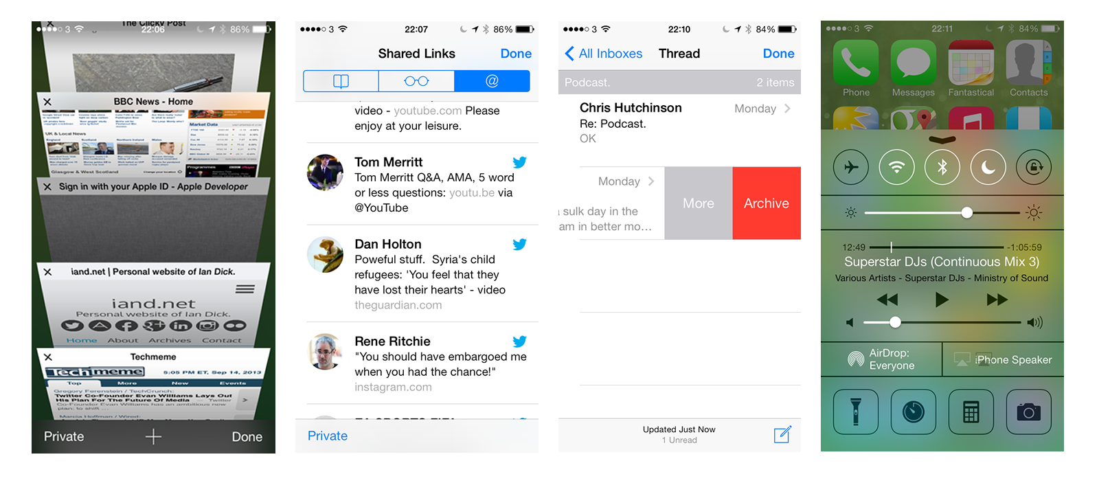
There’s a lot of new in iOS 7 compared to previous releases. Control Center allows you to quickly toggle wi-fi, bluetooth, do not disturb and also launch the camera, a flashlight and control your music. Nice implementation of something that Android users have enjoyed for a few years and great to have in iOS. Notification Center has also been tweaked to surface more relevant content and also make it easier to segregate the many notifications you receive. It will show you upcoming appointments more clearly and also tell you when to set off to meet your appointment on time.
Another updated feature is Multitasking. A new card view allows you to easily swap to applications and dismiss others but iOS 7 promises to analyse your usage and ensure that app’s you use at certain times of the day will already have their feeds updated. Intelligent updates sound great and I’m looking forward to some of my fav app’s being updated to support this. The camera app has been updated and so like every other photo app it now has filters. Who would have thought filters would have become the must have feature. The Photo app also has does a great job of helping to sort your images by grouping photo’s into Years, Collections and Moments. A visual way of browsing through photo’s and it’s one of my favourite new features. They’ve also finally added shared photo streams via iCloud. A no brainer and shouldn’t have needed a new version of iOS to introduce this.
Airdrop finally allows you to share data with those on the same wi-fi network easily. Was a feature of Mountain Lion (maybe even Lion) so good to see it finally coming to iOS. Worth mentioning is iCloud Keychain which is a secure way of sharing passwords, credit cards, logins between your Mac and iOS devices but it’s now marked as coming soon – probably waiting for Mavericks to be released. Facetime now supports audio only calls too – free audio calling!
Finally app’s can now update automatically. Hurrah, although you miss understanding new features if you switch this on.
Updated Applications
All the existing app’s have seen their design changed to support the new look iOS. Some are quite subtle where as others feel very different. Almost all of the app’s have lost the skeuomorphic textures and design that had been favoured by Steve Jobs and Scott Forstall. Calendar, Maps and Weather fit in very well and even the refresh on Safari and Mail has seen some new gestures added to help with the usability of the app’s although Safari has a habit of hiding a lot of the UI which will cause confusion. Thankfully it’s finally got a unified search field. Thanks Chrome ;).
Reminders and Notes have been refreshed but unlike almost everything else have seen a paper texture applied. It looks weird in context with the changes. The Clock app has also seen one radical new feature – the icon is live and shows the current time with a swooping second hand. Mmm…great.
Verdict
So should you update? Well it’s a moot point as most will update over the next few weeks due to iTunes prompts or the pressure of app’s coming out that require iOS 7. On the iPhone 5 iOS 7 is a really nice upgrade. My 3rd gen iPad hasn’t faired so well. There were lots of rumours that iOS 7 on the iPad was ‘behind’. Apple have never demonstrated iOS 7 running on the iPad and there may well be a good reason with everyone pointing to new iPads in October. iOS 7 updated fine on my iPad but any text input, from unlocking the iPad to searching in Safari, adding text in Drafts or creating an e-mail would cause a 15-20 second pause where any typing was detected but the screen would be frozen. I eventually had to wipe and re-install which cured the issue but I’ve had a couple of reboot’s since. I’m convinced that iOS 7 on the iPad is a bit flaky so if you don’t need to I’d wait until the first patch release or the Apple event in October.
In general I like iOS 7 and despite the odd animation it feels fast on the iPhone 5. What I’m most looking forward to are the applications that will take advantage of the new features and also redesign to fit in better with the new look and feel. It will be an expensive few months as the reset will also be followed by many refreshed app’s that won’t be free. Time to get saving or find some iTunes card deals.
New iPhones
A quick word on the new iPhones. The iPhone 5c looks a solid phone but doesn’t interest me as it’s the same as an iPhone 5 with a colourful shell. What is nice is that iOS 7 knows the colour of the phone and selects a suitable background on first launch – makes the hardware look transparent.
The iPhone 5s, while sharing the design of the 5 features a few new features. Fingerprint unlocking is very nice as I unlock my phone so often with a passcode. The camera updates look great especially the slow motion video and the ability to take 10 photo’s per second. 64 bit should herald faster app’s over time and all this without a drop in battery life thanks to a small increase in battery size without any increase in the overall weight of the phone. I’m far more interested in a 64 bit iPad though.
Instead of black and white the 5s comes in white, gold or space grey which reminds me of the original iPhone. There are enough new features that I’m tempted to pick up a white 5s…but there’s still time to change my mind as there are no pre-order options this year. A solid update of a classic phone.