I’ve used Leopard for around a week now (seeing as I didn’t pirate it) which has given me time to get used to the new features on offer. I’ve pulled together some thoughts below on the main features that impact me but for a detailed review read Ars Technica’s Leopard review. Their Leopard review is the best (and longest) I’ve seen not only covering the obvious new features and graphical changes but also what has altered under the hood.
First Impressions
On logging in to Leopard you notice the most obvious visual change – the new pseudo 3D dock. Instead of a flat dock as in Tiger the icons are displayed on a pretend three dimensional shelf. Reflections of the icons are shown on the shelf as well as any windows above the dock. The icons are no longer bound within the dock and can encroach on your app’s. In Tiger small black triangles indicated the currently running app’s but they have been replaced with blurry glowing lights which don’t stand out very well against the shelf.
![]()
Original Tiger Dock
![]()
New 3D Leopard Dock
I like my graphical flourishes as much as the next geek but when they come at the expense of usability then it grates. The new dock tells me less than previously and takes up more room. Move the dock to the left or right and you get a far more usable dock – if only you could swap the dock when placed at the bottom of the screen to this. There’s no default option but a variety of ways to solve this are available.
![]()
Leopard 2D Dock – far more usable
The next new feature is Stacks. Click on a folder in the dock and a fan or grid view of the folder contents will spring out of the dock. This is really nice for the downloads folder and gives you quick access to it’s contents. However it seems really under developed and even takes away a feature from Tiger. You cannot select the dock icon for a stack. By default it uses the latest or first icon in a given folder unless you cheat and start an icon with the name “__” although you end up with a useless file. Hopefully there will be an option to set the dock icon in a future update. It would be nice to see more than 10 files in the fan view, maybe allowing you to scroll through the list of files via your scroll wheel? Most annoying is that in Tiger you could click and hold on a folder to see a hierarchical view of the folder contents allowing you to quickly browse through folders without opening a finder window. This ability has now been dropped. An oversight? Hopefully. If it’s a feature you’ll miss DragThing will be your saviour. The more I use stacks the more I think it’s a feature added not for the current Apple hardware but for a future touch screen?
Of more success are the other graphical tweaks. Finally gone is the brushed metal look of yesteryear to be replaced by a unified look and feel across all the Mac applications. This has been a great success and gives a far more polished feel to the whole O/S. The menu bar has also been tweaked and is now slightly transparent. I was against this at first but have grown used to it. It ties in nicely with whatever background you are using and doesn’t detract from usability. The menu bar icons also look sharper to me but that’s maybe just my eyes. System icons have been more controversially tweaked and now all come in the same colour but with different graphics to signify music, documents etc. I like this but many feel it is again less usable than Tiger.
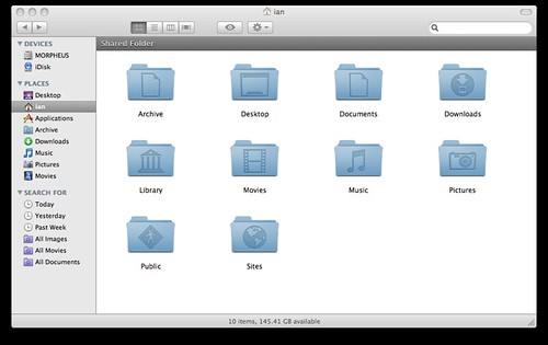
New folder icons
Overall the changes aren’t too bad (once I sorted the dock) although some alterations seem to be there just to be different rather than increase the usability of OS X. All I do know is that Panic will have a lot of customers for CandyBar 3.
Substance
While graphical changes can cause a lot of noise they can be worked around and are probably of least importance over time. It’s the applications and functionality of the O/S that carry the most weight and Leopard delivers a lot of change across most of it’s applications.
The Finder (think Explorer in Windows) has seen a lot of improvements. It now has the look and feel of iTunes and the sidebar is now more organised than in Tiger. The speed of the application is better than in Tiger and there’s a couple of improvements to help you search more visually than before. Full icon previews of the files means that you can identify your files more quickly than by icon or file name alone. Cover Flow has been added to Finder which in some ways is a gimmick but scrolling through large views of images and documents is a really good way of finding you files. It’s a shame that Cover Flow isn’t available in all file dialogues though.
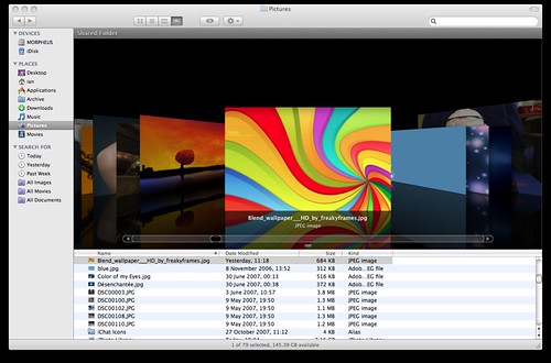
Cover Flow view of images
Alongside Cover Flow is Quick Look. Want to view a file without loading the application – highlight the file and press space. Almost instantly the file is loaded in a lightweight viewer. Office and iWork documents, images, pdf’s and movies can all be viewed in Quick Look and it’s amazing the difference this app makes to using the Finder. Scrolling through an excel sheet only a couple of seconds after highlighting it still impresses me. Once you get used to this way of working you again miss Quick Look from dialogue windows but hopefully this will be addressed in an update. As Quick Look is plug-in aware any future file formats (new Office for example) can be supported.
One final improvement that makes a big difference to me is that network drives/shares are loaded in a separate thread in Leopard. Previously accessing my NAS or iDisk would tie up every Finder window. Not any more making NAS and iDisk more usable. Hooray.
Spotlight is now faster and more importantly returns application searches instantly. While waiting for a Leopard compatible QuickSilver it was a great replacement or application launching. Preview which in some ways is replaced by Quick Look has had a tweak to it’s toolset. It can now crop and resize images and also has some nice PDF handling tools including merging PDF’s together.
A change to help manage desktop real estate is Spaces. I’ve used virtual desktops for years on Solaris and Windows and while there have been applications that give Mac users virtual windows it’s good to see it built into the O/S. You can have up to 16 windows and although I’ve not enabled them on the desktop, on the laptop it’s been great to have more space to work in. I’ve ended up using three desktops, one for Mail and Firefox and messenger apps, one for media and a final one which is used as a primary desktop for the task I’m working on. Keeps me more focussed, less distracted and gives me some room to play with on the smaller screen. However it’s annoying you can’t name each desktop or give the desktop a different wallpaper. This would make it far easier to work with. It’s great to have Expose support though in Spaces. That one feature alone makes Spaces superior to the other Mac virtual desktop managers.
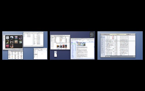
My three spaces
To round off this section I must mention Time Machine which is obviously the big addition to Mac OS X from Apple’s perspective. They’ve even focussed the branding on a space concept as can be seen from the packaging and the default desktop. Anyway, Time Machine is an easy way to backup your whole system. Plug in an external drive (I highly recommend Firewire 800 as it is so much faster than USB2) and the system will ask if you want to enable Time Machine using this drive. Click yes and your system will backup to the drive. From then on every hour, assuming the drive is connected, Time Machine will back up any changes to your system to the drive. Want to retrieve a file? Hit time Machine and the screen will turn into a star field and you can browse back through time to find the file you need. Easy, wonderful to look at and finally an application that takes the hard work out of backups and will probably be the driver into more users backing up their data. While I was buying Leopard in the Apple store two other customers were also buying external drives as ‘Time Machine needs it’. It’s all good…almost.
First of all the backup isn’t bootable and that’s a real shame. You can use the install disks to get round that issue or even copy the image to the Time Machine hard disk to give you a portable solution. For me there’s still a couple of issues though. I’m not sure what happens when you fill your external drive. Can you move the data to a new larger volume or do you need to start again losing your previous history? I also think it’s not a good solution if you churn a lot of data. Take downloading TV shows for example. Rar’s and par’s are downloaded to you machine to create an avi then deleted. I don’t really want the rar’s and par’s backed up but by default they would be. How much room will that external drive need? I can switch off certain directories from being backed up but that gives me a less than complete solution, no?
That;s why I’ll be sticking with SuperDuper!. I’ve used it for a year now and it’s never failed me, it gives me a bootable backup quickly via incremental backups and it gives me what I’m looking for in a backup application. I think if your serious about backups you’d be wise to look at SuperDuper! instead of Time Machine.
Applications
So what about the other applications? Unlike Windows I use a lot of the core Mac OS X app’s so any changes to these are welcome.
Mail is now a LOT quicker. Once my mail (around 3-4000 messages) was imported the speed when selecting a folder or searching the mail was greatly improved over Tiger. There’s also a couple of new features that should have been added via an update, not a new O/S. There are now to-do’s and notes within Mail. The to-do’s are actually mail messages and so sync to each mail client. The notes (also e-mails) appear with a ghastly font and yellow notepaper. Thankfully the font can be changed – shame about the notepaper. RSS feeds are now supported in Mail which also features a nasty new feature – stationary. When I saw this in Outlook and Outlook Express I sighed – now it’s available in Mail too. It works well but is so unnecessary.
iCal and Address Book have seen minor updates that don’t have much day to day bearing on me. I do like the graphical tweaks to iCal though. Very nice. Textedit now supports Word 2007. To be honest it’s a pretty capable word processor now and with a couple more features it would remove the need to get another editor.
iChat has received an amazing amount of updates but like Mail, I would have hoped most would have been delivered outside of an O/S release. Tabbed chat windows are nicely done as is the ability to screen share and share documents which looks great. There are also new video effects – basic green screening which places you on top of any video you like. While a nice idea I’ve yet to see it work seamlessly. There’s always a missing arm or broken graphics. I just wish iChat supported more chat protocols as it means I still need Adium. In fact Adium 2.0 which is promising audio and video support could well do away with iChat.
 There’s a host of other improvements but these are the ones that caught my eye. The airport menu now shows secure and open networks. If it had a strength indicator it would be perfect. The dictionary app now includes Wikipedia searching and the results are delivered fast and also rendered very well. The web clip feature in Safari allows you to select any part of a web page and turn it into a dashboard widget. This is easy, quick and very effective. Anyone can now create a widget based on BBC Weather, Halo 3 stats, football results…the web is your oyster. Safari is actually a very quick browser and felt slightly faster than Firefox but I still have a reliance on certain Firefox extensions so won’t be moving to it.
Front Row now shares the same front end as Apple TV. It looks great and the iTunes integration plus the integration from the Apple movie trailers site is a joy to behold. ![]() I would like the option to choose UK playlist’s though and also swap to HD trailers rather than the SD videos. Another little change I like is that the iCal icon in the dock no longer stays static and displays the current date. No need for iConiCal now.
I would like the option to choose UK playlist’s though and also swap to HD trailers rather than the SD videos. Another little change I like is that the iCal icon in the dock no longer stays static and displays the current date. No need for iConiCal now.
Finally, good old .Mac has seen some new features added. You can now sync desktop widgets, dock items, notes and preferences across Macs. The biggest new feature though is Back to my Mac. I can now connect to my iMac from anywhere via screen sharing even if my home IP address changes. While other products offer similar features the Mac screen sharing is superior to anything I’ve used before and I can easily drag files from the iMac to the laptop (demo here). This is my favourite new feature in Leopard so far. Screen sharing looks very good, certainly better than most other VNC type app’s I’ve used.
Installing, performing and what happens next?
So before I wrap up, some thoughts on installing. I should have done this up front but it’s ended up here. By all accounts Leopard’s upgrade route from Tiger looks to be very good and received the most testing at Apple. However I chose to format and install and after going down this route I have absolutely no regrets. There are a number of users who got Apples very own blue screen of death on doing the upgrade, all of whom had APE installed or at least an older version of APE. Most seem not to have known they had it installed – Logitech use it for their mouse driver for example. It’s this fiddling at the low level by some app’s that the end user won’t know about that worried me. A format rules this out and I would recommend that route to anyone about to install Leopard.
Any upgrade brings the risk of making your machine feel sluggish – just ask Vista owners. I hadn’t upgraded OS X before so had no idea what to expect. So far performance feels faster than under Tiger. This is helped by a faster Finder, Mail and Spotlight but start, shutdown and sleep times seem the same as before which is great. I’ve also had no stability issues apart from .Mac. This has been slow to access and sync was also down for a large part of Friday. Hopefully just post launch teething issues.
What’s more exciting is what the next 12-18 months will bring from third party developers. Under the hood updates to development tools and the new Core Animation should mean some radical changes to the app’s delivered on the Mac platform. Not too much has been seen yet although a preview of Delicious Library 2 promises some great features. I can’t wait.
So is Leopard worth it?
Many have said that this isn’t much of an O/S update. I totally disagree and see a great deal of benefit in Leopard, with new features, a faster O/S and so much new potential. Time Machine, if it encourages more people to back up their data, will be reason enough for many to upgrade.
iMac desktop
As to whether you do it right away, well that’s another matter. There are many applications still not available for Leopard as Apple didn’t release the final build to developers until launch day. This was a pretty poor decision in my opinion. It didn’t stop piracy (one of my Mac friends had Leopard installed two days before release!) and has only lead to disappointment for many consumers whose third party applications no longer work. There are also a few bugs in Leopard and although none have been catastrophic for me, unless you have a pressing reason to upgrade I would hold off until the bug fix has been released by Apple and third party app’s are fully upgraded. Hopefully that will be before Macworld in January. It’s a great O/S but needs a few bugs ironed out first. That said, I wouldn’t go back to Tiger. Leopard FTW.
Macbook pro desktop
Nice write up. I doubt I’ll upgrade to Leopard for a long time.
About the Airport section, there are things available to show signal strength and the status of a network, I use one on my Powerbook. It’s slow as hell though.
The new dock doesn’t bother me as much as the folder icons, what were they thinking? It’ll be the first thing I change.
Now, gimme that Pro wallpaper please!! 😉
Wallpaper sent. Once I find the link for it I’ll post it here too.